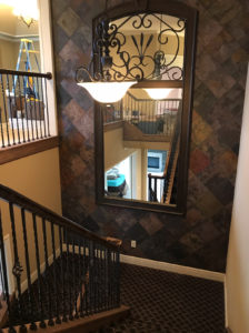
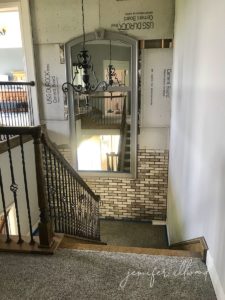
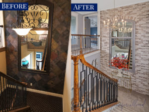
When we moved into the new house, the slate wall was really a focal point. I can remember seeing it 10 years ago when I worked on this house with my Magic Brush Inc. painting company, and I just thought it was incredible. It was covered in slate and had this HUGE mirror, so you could see yourself walking down the stairs. There was some iron on the mirror and it was absolutely lovely.
But when we moved into the house, we were really working on getting rid of the slate. We started with getting rid of the slate on the floors (post on that HERE), the front steps (post on that HERE), and we wanted to get rid of it on the wall/stairs as well.
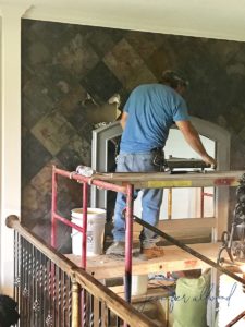
But the challenge was that slate is soooo heavy. We had several people who didn’t really want to help remove it because they knew it would ruin the sheetrock and make a mess all over the new stair carpet. We actually put in our new carpet before redoing this… kind of out of order, but oh well. It happens! LOL.
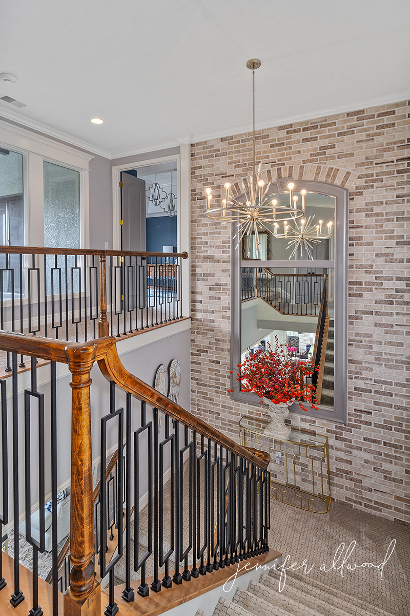
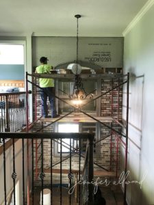
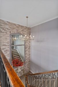
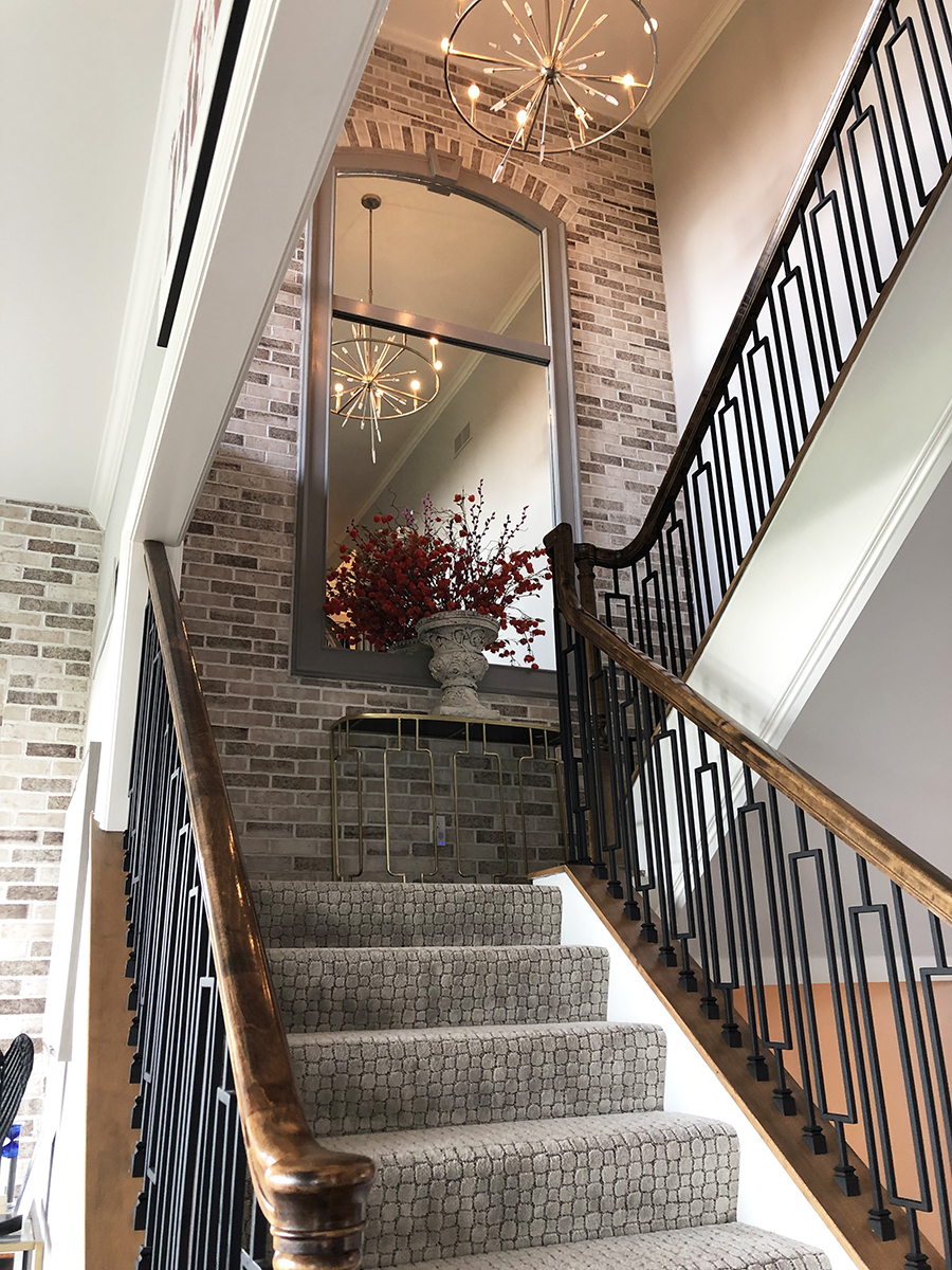
Whatever we decided to put on the slate wall, we really wanted it to match other areas of the house. We thought it would be gorgeous if we could tie in this wall with our brick arch in the kitchen and our brick fireplace. We had the same gentleman, David, come in and do that.
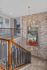
They put up the brick, which is not a full brick. It’s a partial brick that looks like it has black grout, but that’s actually just the mud behind the bricks. Then, they grouted it in a really light color. I absolutely love it. I especially love that we painted the mirror in Sherwin-Williams Pewter Cast, which is the same as all the other doors in the house. You can read all about our light interior doors HERE!
We took the iron off the top of the mirror just like we took the iron off of the front doors (read about that HERE!). We really felt like this gave it a cleaner look. Once we put the gold chandelier in front of it, I was sold!!!
It’s really the highlight of the upstairs. We can see it from the downstairs view and we can see it when we’re walking down the stairs from the bedrooms and I just absolutely love how it turned out.
Here’s a little before and after so you can really see how much it brightened and lightened the space!!!
Love, love, love! If you missed the blog post on our new mock croc carpet, you can read all about that HERE!
You can subscribe to my blog HERE so you get the next home update straight to your inbox!
And feel free to use the graphic below so you can save this blog post on your Pinterest board 🙂

